The Architecture of UX in Fintech and Payment Orchestration
The Art of Making the Difficult Look Easy
Behind a performance that appears utterly effortless, fluid, and simple from the outside lies years of discipline, deep accumulated knowledge, and seamless mastery. An expert in their field manages the enormous complexity within their domain with such grace that an inevitable illusion forms in the observer's mind: "This is really so simple, I could do it too." Yet the reality is quite the opposite. Eliminating clumsiness within a discipline and making the complex appear simple is the highest level of mastery, one that requires command of all theoretical and practical foundations of that craft. The fintech
ecosystem, and particularly the world of Payment Orchestration, is one of the foremost areas where this illusion is most tangibly experienced. The massive data flows operating in the background, multi-bank and PSP integrations, complex routing algorithms, security protocols, and regulatory obligations must all be reduced to a single click on the front end. What truly matters is being able to serve the customer a flawless meal without ever letting them feel the chaos, the storm, and the high stress in the kitchen. However, in domains with high complexity like fintech, remaining comprehensible for both merchants and end users is today's greatest product and experience (UX) challenge. The quality of a product or service is not measured by the magnitude of the technology hidden behind it, but by how effortlessly it makes that technology feel to the user. True mastery in financial technologies is making the massive infrastructure complexity behind the scenes invisible, and presenting the user with a smooth, secure, and comprehensible experience.

Transitioning from the t(0) Moment to the t(-1) Moment: Preventing Problems Before They Occur
In fintech products, support and operations teams typically deal with the moment a problem arises — the t(0) moment. A request comes from a customer, a ticket is opened; with high know-how and a strong technical team, the problem is resolved and moved to "completed" status. From an operational standpoint, this process may appear to be managed extremely successfully. However, when we look at the matter from a true UX perspective, the real success is not quickly solving the problem at the t(0) moment, but going back to the t(-1) moment and completely eliminating the possibility of that problem occurring.
The essence of UX is being able to provide the right guidance before the user experiences confusion, before the system produces an error, or before the process hits a wall. Stepping one step back from the t(0) moment leaves product designers and product managers face to face with this critical question: How can this service or interface guide the user into the correct flow before they even encounter the problem?
Overcoming Domain Blindness and Truly Listening to the User
Conventional UX practices are shaped around surveys, persona definitions, market research, competitor analyses (benchmarks), and usability tests. These methods are certainly fundamental building blocks. However, in complex fields requiring vertical expertise like financial technologies, standard templates may not always yield the right results. As your command of the payment domain increases, an inevitable risk of "domain blindness" emerges. A flow that seems perfectly clear, logical, and lean to the product team can turn into a completely meaningless labyrinth in the eyes of a merchant or end
user encountering the system for the first time.

At Craftgate, while building the payment orchestration experience, we embrace a culture of always starting by thinking one step back and in reverse. How much you engage users with a product matters as much as how "indispensable" you make it for them. At this point, rather than relying on desk-based assumptions or solely on competitor analyses, we establish direct contact with users. Through one-on-one communication with our merchants, interactive prototype tests, and continuous validation processes, we break through domain blindness and narrow discussion windows based on data.
Understanding the Multi-Stakeholder Ecosystem: Who Are We Designing the Product For and Why?
In the fintech world, what truly makes a product "indispensable" is not just solving immediate problems; it's being able to keep the user in a continuous, painless, and high-value interaction with that product. However, in systems with broad scope like payment orchestration, it is impossible to speak of a single homogeneous user profile.
On one side are the finance, operations, and support teams who actively use the panel every day; on the other are the developers who handle integrations and live with API documentation; and ultimately, there are the end users who encounter that payment step. In this multi-stakeholder equation, a solution designed for one side can create new friction for the other. That's why at Craftgate, when we begin building a product, the first question we ask is not "How can we make this screen more elegant?" but rather "Who exactly are we designing this product for, in what context, and to address which need?"
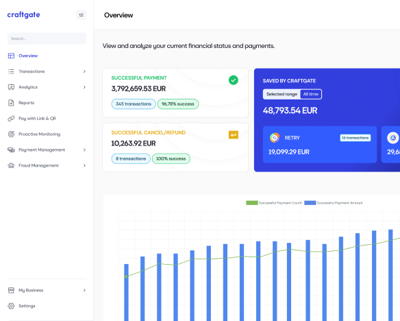
Bringing together the expectations and priorities of different stakeholders on the same pla tf orm requires going beyond standard UI methodologies. From low-cognitive-load documentation that shortens the developer's integration time, to dashboard screens where a finance manager can analyze thousands of transactions at a glance — every touchpoint must be treated as part of a holistic experience philosophy.
Craftgate Experience Architecture: 5 Core UX Strategies
While simplifying complex systems and lightening the operational burden on our merchants, we build our decisions on 5 main strategic pillars:

1. Lean & Frictionless
We aim for merchants to reach their goals with the fewest clicks, the lowest cognitive load, and the least confusion. Every component, element, or text in our interfaces exists only as long as it adds clear value. Our goal is not to be cumbersome, but to deliver a fast, fluid, and intuitive experience.
2. Customizability (Modularity & Flexibility)
Every merchant has a different business model, financial flow, and operational dynamic. Rather than offering a rigid, one-size fits-all panel, we provide a flexible and modular platform that can be shaped according to business processes. Craftgate transforms from being a static product into a strategic business partner that adapts to each merchant's own processes, continuously living and evolving.
3. Progressive Disclosure
A user entering the system for the first time needs to start generating value from the very first minute they encounter the panel. However, this simplicity should not slow down experienced users. With the Progressive Disclosure principle, we present a clean screen that doesn't overwhelm beginners, while providing expert users who want to access advanced settings, filtering combinations, and shortcuts as they go deeper with the flexibility they seek.
4. Data-Driven Approach (Evidence-Based Design)
We base our design decisions not on personal assumptions, aesthetic concerns, or popular trends, but on concrete user data. We examine at which steps users hesitate using analytics tools, and continuously try to validate and measure our assumptions through A / B tests and measurable metrics.
5. Human-Centric B2B
Designing a B2B and financial product does not mean producing cold and mechanical interfaces. We never forget that on the other side of the screen are real people who may be panicking, racing against time, afraid of making mistakes, or in need of support. From error messages to confirmation notifications, we use a humane language in every micro-text that empathizes, guides correctly, and inspires trust.