Driving traffic to an e-commerce website and turning that traffic into sales takes time and investment. When customers have found products they like and added them to their cart, the checkout experience should help them complete the purchase. Unnecessary steps, confusing card fields, and unclear payment errors can interrupt that experience.
Reducing cart abandonment requires attention to the entire checkout flow: cart design, delivery and billing information, payment options, card validation, and the messages customers see when something goes wrong. This guide brings these elements together to help you improve the shopping experience and increase conversion rates.
What Is Cart Abandonment, and Where Does Checkout Fit In?
Cart abandonment occurs when a customer adds products to a shopping cart but leaves before completing the purchase. A completed purchase represents a cart conversion. The payment stage is part of this journey: a checkout or payment page allows customers to enter the information needed to pay for their order from their chosen device.
An e-commerce purchase generally involves three main stages:
- Cart and product selection.
- Delivery and billing address selection.
- Payment.
Why Does Checkout Optimization Matter?
The Baymard Institute's cart abandonment research reports an average documented abandonment rate of 70.22%, calculated from 50 studies. This is an average across studies, rather than a measurement of 50 individual e-commerce websites. It illustrates how frequently carts are left without a completed purchase, although individual businesses' rates vary.
Baymard also estimates that the average large e-commerce site could achieve a 35.26% increase in conversion rate by improving checkout design and addressing the usability issues identified in its research. This describes potential improvement for the sites studied, rather than a guaranteed result for every business.
A simpler, clearer checkout can help customers complete their orders. Making the process more complicated creates additional friction, so optimization should focus on removing unnecessary effort and helping users understand what to do next.
How to Improve the Cart and Checkout Flow
Minimize Page Transitions and Clicks
Keep the cart and payment journey to a maximum of three pages: the cart, delivery and billing details, and payment. Show customers which stage they are at, and keep the cart summary available as they move through the process.
The fewer clicks customers need to complete a transaction, the less effort the process requires. One-click or express checkout can make the journey shorter. Customers should be able to reach the payment step quickly, without unnecessary transitions between pages.
Remove Distractions and Preserve Checkout Progress
Design the checkout clearly and simply. Remove links, images, and banners that take customers away from the purchase flow. If you need to display a campaign announcement, gift coupon, or additional information, consider showing it in a lightbox or pop-up within the current page.
Customers should retain their cart and delivery or billing information when moving backward or forward between steps. Manage this information through an appropriately secured checkout session; cookies can identify the session without containing the customer's payment details. Customers should not have to re-enter information simply because they returned to an earlier step.
This approach does not mean storing card numbers or security codes in cookies. In particular, PCI DSS prohibits retaining card verification codes such as CVC or CVV after authorization, even if they are encrypted.
Keep Important Actions Within the Visible Area
The most visible parts of a page are generally those customers can see without scrolling. Keep the information and actions needed to continue the purchase within that area wherever possible.
For example, if a cart contains many products, a purchase button placed only at the bottom may remain out of sight. Positioning the purchase or continue action at both the top and bottom can help customers proceed without searching for it.
Show Progress and Confirm the Order
Tell customers which stage of checkout they are at and what remains before the order is complete. A progress indicator can help. On the payment page, show a summary of the products and delivery or billing details so customers can review their order without leaving the step.
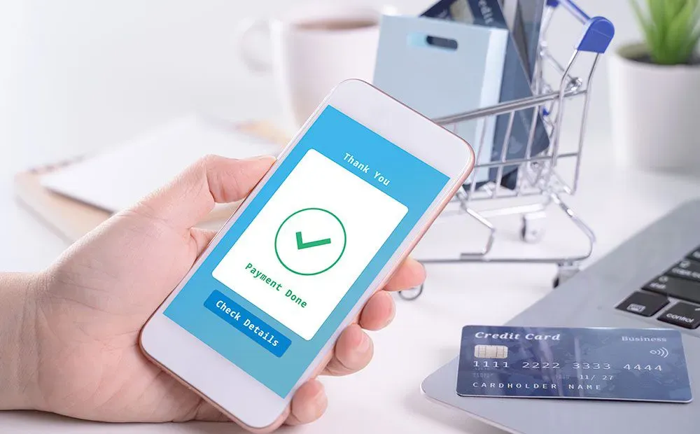
Once payment is completed, display a confirmation screen explaining that the order has been placed. Notifications about the delivery process can also help keep customers informed after checkout.
Allow Guest Checkout
Membership systems can support customer loyalty, personalized campaigns, and marketing activities. However, creating an account may not suit every customer's preference. Allow customers to complete their purchase without registering so membership does not become an obstacle at the payment stage.
Present Agreements and Information Before Payment
Present the Distance Sales Agreement and Preliminary Information Form before payment and obtain the customer's approval. These documents communicate company and customer information, return and cancellation policies, and the parties' responsibilities.
The checkbox confirming that the customer has read and approved these documents should not be preselected. Customers should make that choice themselves before completing the transaction.
Offer Different Payment Methods
Customers' payment preferences differ. Alongside card payments, consider options such as pay by link, QR code, and alternative payment methods. Offering different methods gives customers more ways to complete their purchase using an option that suits them.
How to Design the Card Payment Form
Card form design is another part of the checkout experience. The following recommendations can help reduce input errors and simplify payment; they should be considered in the context of your checkout rather than treated as universal design rules.
Use Clear Labels and a Consistent Field Order
When offering multiple payment alternatives, make the card payment option the default. Use labels such as Card Number and Cardholder Name instead of labels that imply only credit cards are accepted, since customers may also use debit or prepaid cards. Collect the cardholder's full name in one input field.
Display the card fields in this order:
- Cardholder name.
- Card number.
- Expiration date.
- Security code (CVC/CVV).
This order avoids asking for the security code before the expiration date, which may otherwise require customers to turn the card over and then back again while entering its details.
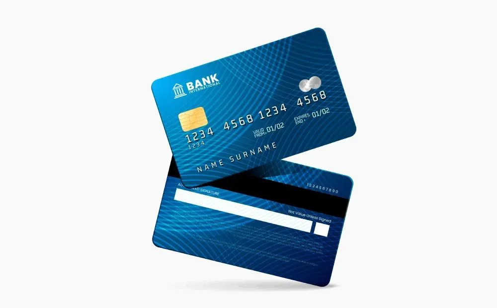
Group the card number visually, for example as 4043 0812 1111 2222, to make it easier to read and enter. Use separate month and year controls for the expiration date, preferably with typed input available, and a numeric month/year format such as MM/YY or MM/YYYY.
Identify the Card Through BIN Information
Do not ask customers to select their issuing bank or card network manually. Use the card's BIN/IIN information to identify these details from the card number. The BIN can consist of the first six or eight digits.
BIN information can identify the card network, such as Visa, Mastercard, or American Express; its category, such as credit, debit, or prepaid; its card family, such as Wings, Bonus, Maximiles, or World; its issuing bank; and whether it is a personal or business card. For further background, see our guide to the fundamentals of payment systems.
Craftgate regularly obtains and updates its BIN/IIN list using information from BKM and banks, and provides a BIN query service. After the card number has been entered, display the relevant installment options and card- or bank-specific offers. Where applicable, show opportunities such as installments at the cash price, deferred installments, or extra points in an informative lightbox or banner so customers can evaluate their card options.
Support Security and Customer Confidence
Offer the 3D Secure option and enable customers to pay with 3D Secure according to their preference. The payment page should use HTTPS, and the logos of the banks, card networks, and payment infrastructure providers you work with should be displayed.

A clear form and consistent presentation can support customer confidence. You can explore Craftgate's Payment Form, Common Payment Page, and Secure Fields solutions for the technical implementation of payment fields and pages.
Validate Card Information Before Sending the Payment Request
Perform syntactic and semantic validation on both the front end and the server before sending the request to the bank. These checks help identify input errors and payment options that are not available for the entered card.
- Cardholder name: Validate the cardholder name according to the rules defined for your payment flow. Show a clear message if the information is missing or invalid.
- Card number format: The card number must contain numeric digits only, in the range
0–9, without letters. For the card formats described here, Visa and Mastercard numbers have 16 digits, and American Express numbers have 15 digits. - Security code: CVC2 must contain three numeric digits for Visa and Mastercard, and four for American Express. For these formats, the card number and security code together total 19 digits.
- Card number validation: The number must pass the Luhn algorithm. Perform this validation in client-side JavaScript and on the server.
- Expiration date: The entered month and year must be the current month and year or a later date.
- Debit or prepaid card: Hide the installment options when the entered card is a debit card or prepaid card.
- No virtual POS for the issuing bank: If the entered card belongs to a bank for which you do not have a virtual POS, hide the installment options and require payment in full. Installments cannot be offered for that bank's credit cards through a virtual POS you do not have.
- Issuing bank's virtual POS is inactive: If you have a virtual POS for the card's bank but it is currently inactive, inform the customer, hide installment options, and require payment in full. In this case, the request is processed through the other bank's virtual POS set as the default in the system at that time.
Explain Validation Errors Clearly
When a customer cannot pass a validation check, display a message that identifies the issue and helps them continue. Keep front-end and server-side validation messages consistent.
- “Your cardholder name is invalid.” Please check the name printed on your card and try again.
- “Your card number is invalid.” Show this when the number does not meet the numeric and length requirements for the card formats described above, or fails the Luhn check.
- “Your expiration date is invalid.” Show this when the month/year is earlier than the current month/year or the entered values are not numeric.
- “Your security code is invalid.” Show this when the code is not numeric or does not have the required length: three digits for Visa and Mastercard, or four for American Express.
- “Installments are not available for your card.” Show this if an unavailable installment option is submitted, such as for a debit or prepaid card, a card whose bank has no virtual POS in your setup, or a card whose corresponding virtual POS is inactive.
- “Only 3D Secure transactions can be made with your card.” Show this when a non-3D Secure transaction is attempted with a debit or prepaid card.
- “The product you selected is out of stock.” Show this if a product sells out or becomes unavailable while the customer is moving through checkout.
Classify Bank Errors and Help Customers Retry
Passing validation does not guarantee that a payment will be approved. Approximately 15–20 out of every 100 payment requests sent to the bank can still fail. The approximate breakdown of these failures is as follows:
- 33–38%: Insufficient limit.
- 15–18%: General decline or transaction not approved.
- 10–12%: Invalid or expired expiration date.
- 2–3%: Invalid security code/CVC2.
- 29–40%: Other errors, including a card disabled for online payments, exceeding the daily transaction limit, attempting installments for an amount below TRY 1, reusing an order number, attempting a transaction with a stolen card, authorization restrictions, unavailable installments, transactions not recognized by the cardholder, access issues, and system problems.
Banks return an error code and message when a request fails, but these codes and messages can differ between banks. Even within one bank, an error code may have different messages, and a particular message may appear under different codes.
For example, error code 051 used by banks working with the Payten/Asseco API and by Garanti Bank may indicate an insufficient limit. Codes 061, 065, and 099 can also indicate an insufficient limit depending on the message returned.
Classify the bank's response using a rule set that considers both the error code and message. Then explain the result in language the customer can understand. A customer who understands why the payment failed is better placed to choose a useful next step.
For example, instead of showing only a generic decline message, explain: “Your card limit is insufficient for a transaction of TRY XX.” A customer using a virtual card may increase its limit, or choose another card to complete the payment.
Reducing cart abandonment requires both a clear checkout and a payment flow that helps customers recover from errors. By simplifying the journey, presenting suitable payment options, validating card details, and explaining failures clearly, you can improve the customer experience from the cart to the completed order. To discuss how Craftgate's payment orchestration solutions can support your checkout and payment processes, contact our team.